
![]()
The Design
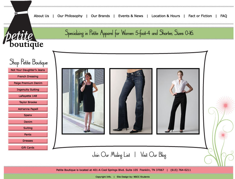
![]() Petite Boutique wanted a web site with largely the same features as their current site, but with a product gallery as well. Ms. Roe was already web-savy, so she was able to tell us exactly how she wanted the site to look and function. She knew exactly what elements she wanted in the top and side navigation and the general layout she was looking for in the inner pages. Our job would be to create a new design for the site and add the online gallery. She provided us with existing brochures and advertising materials to use as inspiration and guidance in our mockup designs. Kristy, Jennifer and Melissa each came up with designs for the Petite Boutique home page. In addition, Kristy created mockups of three of the inner pages. Feeling at a total loss in designing a women’s fashion web site, I focused my design efforts on YS4U instead. Each of the resulting designs used specific elements from the materials Ms. Roe provided us and from the existing PB web site.
Petite Boutique wanted a web site with largely the same features as their current site, but with a product gallery as well. Ms. Roe was already web-savy, so she was able to tell us exactly how she wanted the site to look and function. She knew exactly what elements she wanted in the top and side navigation and the general layout she was looking for in the inner pages. Our job would be to create a new design for the site and add the online gallery. She provided us with existing brochures and advertising materials to use as inspiration and guidance in our mockup designs. Kristy, Jennifer and Melissa each came up with designs for the Petite Boutique home page. In addition, Kristy created mockups of three of the inner pages. Feeling at a total loss in designing a women’s fashion web site, I focused my design efforts on YS4U instead. Each of the resulting designs used specific elements from the materials Ms. Roe provided us and from the existing PB web site.
We sent these designs to Laurie to look over and she selected elements of each design that she liked. We discussed how these ideas could be implemented into a single design and made sketches of what that design might look like. Kristy and Jen then did three more revised mock-ups. Laurie chose this one, one of Jen's designs, to be the basis for our web creation.
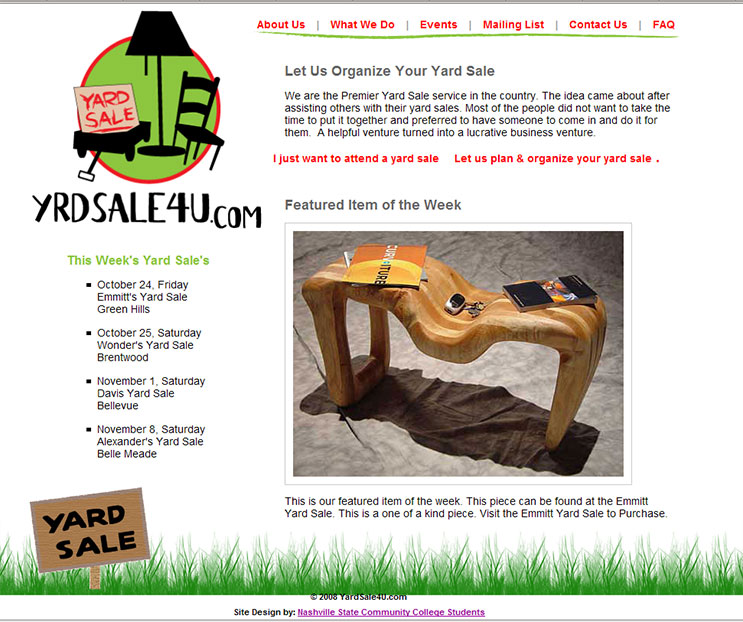
![]() Lynn Shelton of YrdSale4U was less specific about what she wanted. The initial request was for a site with just three pages, Home, Events, and Contact Us. She wanted an informal relaxed style of design that related to the nature of a typical yard sale. She also wanted to have a “featured item” from an upcoming yard sale displayed on the home page. Those were pretty much the only constraints to our designs. All four of us designed mock-ups of the home page. Kristy also did one of the inner pages. Applying what I’ve learned about web site design, I took the liberty of adding three additional pages to the design, What We Do, FAQ and About Us. I then created mock-ups for all of the distinctive inner pages. This PDF contains my design work from this first design phase.
Lynn Shelton of YrdSale4U was less specific about what she wanted. The initial request was for a site with just three pages, Home, Events, and Contact Us. She wanted an informal relaxed style of design that related to the nature of a typical yard sale. She also wanted to have a “featured item” from an upcoming yard sale displayed on the home page. Those were pretty much the only constraints to our designs. All four of us designed mock-ups of the home page. Kristy also did one of the inner pages. Applying what I’ve learned about web site design, I took the liberty of adding three additional pages to the design, What We Do, FAQ and About Us. I then created mock-ups for all of the distinctive inner pages. This PDF contains my design work from this first design phase.
Lynn chose one specific design, but also liked a few specific elements of the other designs. Once again we made several mock-ups, pulling everything into what we hoped would be the final design. Although the result was very appealing, there were certain elements of effective web design that some team members felt were lacking. Being new to having a Web presence, these were design principles that Lynn was unfamiliar with. At one point, Dale came up with an alternate design to keep us moving forward. In the end, after much discussion, a final design was agreed upon which was a conglomerate of the previous "final" mock-up, Dales's design, and my original mock-up. Kristy create this HTML mock-up from those discussions